4 short stories of our attempts to be lean at our startup
March 2, 2014strategy

It’s no secret that I’ve personally been hugely impacted by Eric Ries’ work and the Lean Startup movement. Buffer would not be where it is today without his writings and videos opening my mind to a different way of approaching a startup.
For me, lean is completely about building and approaching things in a way which minimizes the amount of wasted time and effort. A startup is a scary adventure to embark upon because there are so many unknowns. It’s different to a service business in that you have no idea whether your product will actually be adopted. As a result, it’s easy to accidentally build products or features which, in the end, don’t resonate as you had hoped.
Being disciplined about approaching things in a lean way is incredibly difficult. In theory it seems straight-forward. In practice it’s super challenging, and we’ve had some hits and some big misses too.
1. The founding of Buffer: going from an idea to paying customers in 7 weeks
When I finished studying, I was completely set on creating a startup. So I did just that, and I made it completely official. I told everyone I was doing a startup, I incorporated the business and we got a small government grant. I built a product and kept adding more to it. In the end, I hadn’t validated that it was enough of a pain point for people, and it grew very slowly.
With Buffer, I took a different approach. It was just a side project, and I was in no rush to call it more than that. I stopped myself as soon as I realized I’d spent a couple of days coding without validating the need. Then I sat down and thought about how I could see whether people need this product, without building it.
I created a landing page which looked just like it would if the product had existed. That’s the beauty of landing pages, they have almost the same flow through them whether the product exists or not. So I could see whether people would sign up for the product, and then ask them for their email at the end of the process.
I had email conversations and a couple of Skype calls with people who gave me their email. I talked about the problem I was solving and learned a huge amount from these interactions. This is known as customer development and I can’t recommend doing it highly enough.
This process proved to be a success. Through the conversations I learned that others had the same problem and were receptive to a solution. That gave me the confidence to build it, and 7 weeks later I had the first version of the product. 3 days after launch, someone started paying for Buffer. We’ve steadily grown recurring revenue since then. February just came to a close and revenue came in at $333,000.
Read more about Buffer’s lean beginnings
2. Creating a brand new Buffer browser extension experience
One of Buffer’s key features right from the beginning has been that we have a browser extension which allows you to very easily share a web page or blog post you’re reading. You can share it right away or schedule it to be posted later to all the key social networks.
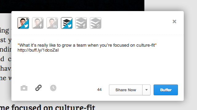
Throughout 2012 we saw a huge rise in sharing of pictures to Facebook, and we started sharing more pictures ourselves. We found they did very well and received a lot of engagement. That’s when we had the idea to transform our extension to allow sharing of different types of media: links, text or picture. We wanted to make it super easy to share a picture from the page you’re looking at.
So (and here comes our big mistake) we got to work building a brand new version of our browser extension to allow you to pick images off the page to share to Facebook or Twitter. It looked a little like this:
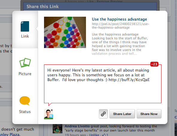
We spent several months working on this alongside other product tasks, and spent some time polishing the experience. We loved the experience ourselves, we were enjoying using it to much more easily share pictures from the page. Then, we were starting to think about when we would launch it to everyone, we though “maybe we can let a few people try it out first”. We almost launched it to everyone at once, which would have been a very bad idea.
We pondered when we could get some people to test it, we thought maybe we could send an email in the next week. Then we thought, why not do that tomorrow? Or how about we send a Tweet right now and ask people if they want to try it. So that’s what we did, and we got on Skype with people and asked them to share their screen and reaction as we switched on the new extension experience.
The feedback from those screen-sharing Skype calls was shocking. 6 out of 7 people were completely confused about the new UI. They thought the picture tab would let them choose the thumbnail for the link they were sharing to Facebook (you could already choose that in the link tab). The biggest mistake we made was that we knew exactly what we wanted to use the feature for ourselves, so the UI made complete sense to us. It wasn’t clear at all for someone seeing it fresh. The worst part is we could have known this months earlier if we’d just done a few mockups and shown those to these same users.
3. Brand New Buffer: a completely redesigned web experience and new iPhone app
In the Summer of 2012 we started to think about some key improvements we should make to the web dashboard for Buffer. We had accounts listed horizontally and this meant there was a natural limit by the width of the page. We wanted to create an interface that would be more flexible. What started as a simple adjustment from a horizontal menu to a vertical menu became a half year project including a complete redesign, new features and unified web and mobile app experiences and design.

One of the core tenets of lean startup is to have small batch sizes. Somehow that went completely out of the window and we decided that we needed to group all of these changes together. We got hungry for a big splash launch and decided that’s what we’d aim for. We envisaged being on all the tech sites and having a surge of new users.
As with everything, this project took longer than we expected. In the end, we managed to wrap it up before the end of the year, which was a relief.
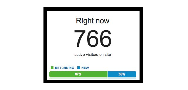
We were successful in getting that big splash we had dreamed of. We emailed our several hundred thousand users and wrotetwo blog posts. We were covered by Lifehacker, TechCrunch, Forbes, VentureBeat, TheNextWeb and more. I remember the excitement as I took this screenshot of our Google Analytics real-time where we had 766 people on Buffer at the same time:
It was several months later when we started to truly focus on metrics and growth that we saw the mistake this big launch was. The problem with grouping all your changes together is that it’s difficult to see how each of the individual changes has impacted everything.
From one day to the next, we had reduced our overall activation by 25%. We count a user as “activated” if they connect a social network and post at least once using Buffer. Activation dropped from 51% to 39% as a result of this launch. In the cloud of buzz and signups, we had no idea and no reason to suspect there was a problem. Upon closer inspection, it was even worse. Taking activation for web by itself, it had actually dropped by 50%. The new design and signup flow caused activation the web contribution to go from 24% to 12%:
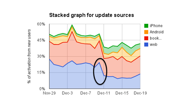
The only positive finding was that our new iPhone app was certainly a success, almost doubling activation for people signing up from the iPhone app:
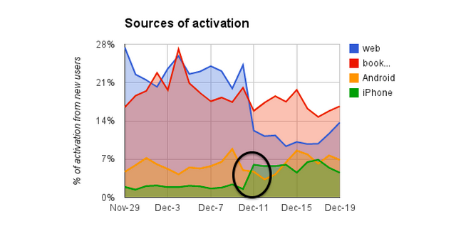
The combination of activation decreasing so much on web and iPhone activation increasing made it hard to see there was a problem. It took us several months to adjust our signup flow to bring the activation back up to previous levels. If we had a/b tested and looked at the metrics of the new web experience with a small percentage of our users before going live with it, we could have identified the drop in activation and fixed it before our big launch. We could have had months of higher activation.
The lesson from this for us is to always launch things in small batches, and to measure the impact of everything we do.
4. How Buffer for Business came into existence, and how it became 25% of our revenue in just a few months
Half way through 2013, Leo and I started to think about our vision for Buffer and whether it was playing out in a way we were happy with. Our vision was to be a sharing platform across the web and apps, and we’d made a lot of progress with our Buffer button across websites and blogs, and our iOS SDK inside Feedly, Pocket, Instapaper, Echofon and others. Our growth was still good, but it was slowing.
We had the amazing chance to meet with Jason Lemkin, who is incredibly experienced and sharp about what it takes to succeed as a SaaS company. We had thought for some time about expanding Buffer and having a product focused on business customers. So far, we’d talked ourselves out of it with the common argument that we should stay focused. Jason gave us some of the best and most controversial advice I’ve had, which was to “do everything, just try it”.
We left that meeting excited and decided we might as well move ahead and see what happens. My co-founder Leo took the lead on investigating the social media problems and needs of businesses.
We had two key product ideas which could be attractive to businesses. The first one we were super excited about: a way to allow the whole organization to connect their personal social media accounts and help spread the news of product launches and press releases. We thought it could be huge for marketing departments. Our second idea was an extension of Buffer, to make it work for businesses and agencies with large numbers of social media accounts and team members.
Leo reached out to several existing customers hitting the limits of our $10/mo plan and jumped on dozens of video calls. He asked them about their problems and shared our ideas to see if they resonated. We were so excited about the idea of supercharging marketing by making use of the whole company’s employees, and were surprised by how few people wanted that product. The best feedback Leo had was from a head of marketing who said:
"I can’t rely on employees to do our marketing. It’s a nice to have, but we wouldn’t pay for that alone."
The idea to make Buffer more powerful was a huge hit. People at the limit of the $10/mo plan were desperate to use Buffer with more than 12 social accounts, which was our current limit. We had a lot of pent-up demand.
So we moved ahead on allowing people to use Buffer for more than the current $10/mo plan. We reflected on how to do this in a lean way and came to the conclusion we could do it without any new features or work on billing. We charged them through the feature to create and change a billing plan in Stripe, and put them onto a plan in our admin area that removed the 12 accounts limit. With no new product or marketing, we suddenly had 50 customers and Buffer for Business generated $10,000 in new revenue, 6% of our total.
We then kept talking to these customers and discovered a handful of additional problems we could solve for them and include in a new product, which we launched as Buffer for Business a couple of months later. It’s been a big hit and is already 25% of our monthly revenue.
P.S. Like using the lean startup approach to build products? I’d love your help - we’re growing the team at Buffer.
Photo credit: Betsy Weber
